Downtown Cranford
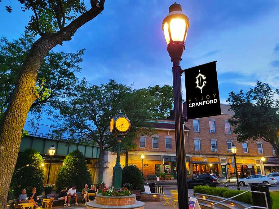
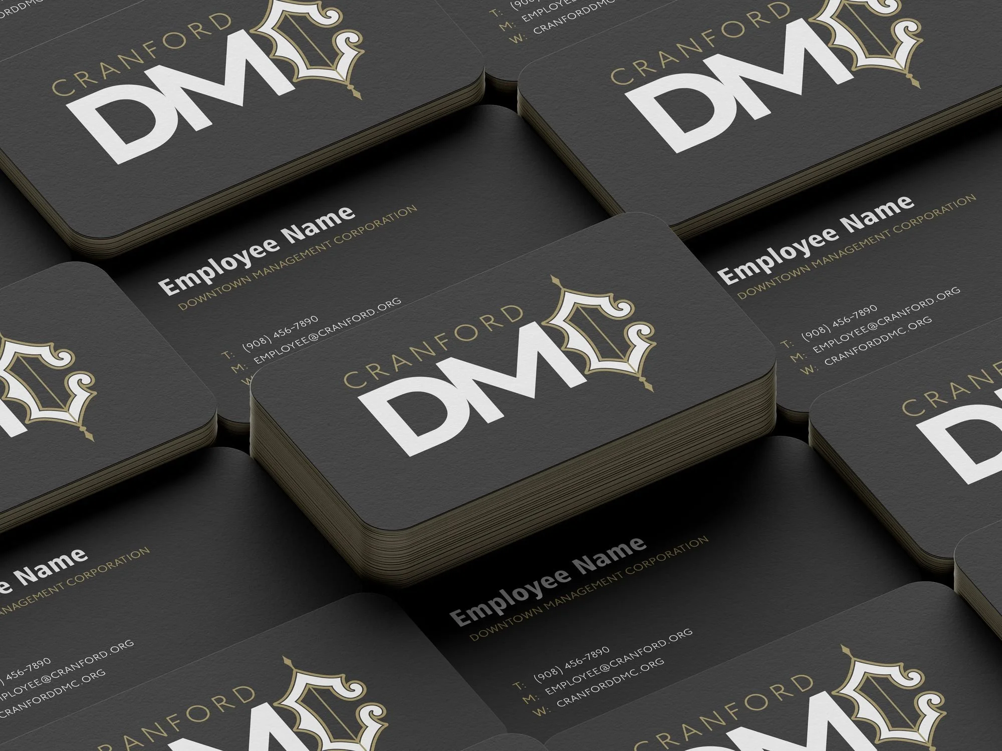
The Downtown Cranford rebrand focused on creating a modern identity that honors the town’s history while making it more adaptable across digital, print, and environmental applications. The previous logo had become dated and difficult to apply consistently, so I explored ways to simplify and refine the visual system. Working closely with the DMC, we discovered an old map of Cranford featuring a unique “C” shape that became the foundation for the new logo. I built a refreshed identity around this mark, designing mockups across signage, merchandise, digital platforms, and promotional materials to show how the brand could live in the real world. The result was a timeless and versatile identity system that better reflects the character and vibrancy of Cranford while supporting local business visibility and community pride
Honoring history, Reimagined for today.


Using historical maps from the early 1900s
we redesigned the downtown logo into a new refeshing way
Client
Downtown Cranford
Year
2018

previous logo
new logo